Sunday, June 24, 2012

Resurgence of the Swing Card

Have you seen the new line of Flip-It dies from Sizzix? Gee...wish these were around when I was struggling with my Christmas cards couple years ago! When I first learned to make this type of card, they were called "Swing" or "Swivel Cards"... now Sizzix is marketing them as "Flip It" cards and making them so easy to create! I especially love that they're available in so many fun shapes!
Anywho, seeing all the excitement generated by these new dies got me wanting to make one again too. Searched my Design Studio files to find the cutfile I created two Christmases ago using the George cartridge so that I could use it again to make this  Swing style birthday card for my dear friend, Kris.
 
Used Cricut Hello Kitty Font cartridge for the Hello Kitty fairy cuts. Created a mirror image of the fairy in blue using Design Studio so I could place her back to back onto the swing element. This way she could appear on both the front and on the inside of the card. The puffy cloud-like label is from Cricut Elegant Edges cartridge. Inked the edges of the label with Tumbled Glass Tim Holtz Distress ink and used it for my sentiment on the front of the card and again as the base for the giftcard holder inside.
Digital patterned paper is from the Chic Jessica Paper Pack by Woofy World at My Grafico, corners are from the Cuttlebug Vintage die set, and font is Lettering Delights LD Charming Light. Added Stickles glitter to the fairy wings, flatback adhesive pearls and a white organza bow to finish it off.
On a side note....with the growing popularity of the Sizzix Flip It dies, I've noticed that several very innovative crafters have even come up with ways to re-create this type of card using other types of shapes dies. Dawn Griffith from Dawns Stampin' Studio uses her Stampin Up Framelits dies and shows how she does it here
 As for myself, I guess I'll need to try and figure out a way to do this card in different shapes using either Design Studio or Make the Cut...lol, I just love a challenge to create a new cutfile!

Sunday, June 17, 2012

So Lucky To Have You As Our Dad!

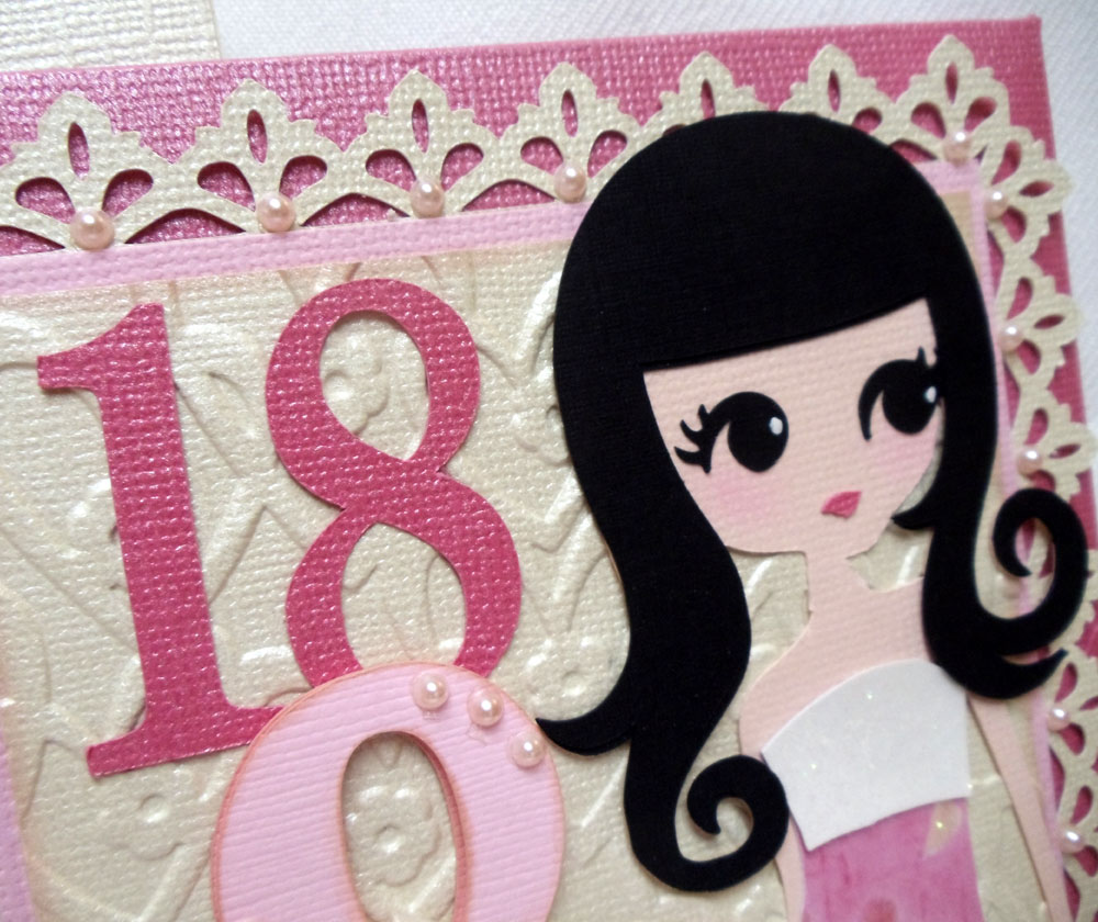
Why is it always such a struggle to come up with creative ideas for Fathers Day cards? For my dad's card this year, I chose to go with a "Maneki Neko" or "Lucky Cat" theme. Last time I looked, he had  Maneki Neko images on his computer as a screensaver, so I'm guessing he likes them. I got the image for my card by doing a Google image search and used MTC to render it into a cutfile. Had my Silhouette Cameo do the cutting and was very pleased that I could capture alot of the thin outlines and details.
Decided to add my paper pieced kitty to a sliding pop up card...pulling on the little tab on the front of the card pulls the front panel up and allows kitty to pop foward. Thought dad would get a kick out of that! You can find the link to Kim Score's tutorial here. I used one of the patterned embossing folders from Cuttlebug's Asian bundle to emboss the back panel. Gold vellum & cardstock, and washi paper were used for the accents. Fonts used for the sentiments were Pharmacy, Tangerine and Leelawadee.
Dh's card was a little easier to come up with. I knew what I wanted it to look like, and happily the final result turned out pretty close to what I had imagined. Don't you love when that happens? My card for dh is another shadowbox card, similar to the graduation cards I made earlier.
Here's a view from the top which makes it easier to see the silhouettes more clearly. The golfer & golfcart silhouette images as well as the photo of the sunset were found by doing another Google image search. Did a quick edit of the silhouettes in Photoshop and had MTC render them into cutfiles and weld them into a window. First, I printed the sunset photo onto glossy photo paper and trimmed it to fit into the recessed window as the backdrop. Next,the silhouette layer was cut in black cardstock, adhered to clear acetate and placed over the front of the recessed window. For the final tan colored layer, I used MTC to create another cutfile of a "negative" layer of the golfer and cart by "un-welding" them from the window so that the golfer's foot and tires of the cart would cut into the edge of the window and be visible when layered onto the black layer.
The library label holding the sentiment was created using Design Studio and a cut from the Cricut Lacy Labels cartridge, then adhered to the front of the card with brass mini brads.
And on the inside, my first try at this type of word pop up. This is something I've been wanting to try for a very long time but have never had the time to sit down and learn how to do till now. Found the tutorials for this at my usual favorite go to place for pop-ups, Extreme Cards And Papercrafting. LOL, after reading thru four of Carol's very detailed tutorial lessons, I decided to take her advice and take the "cheater's way out" by using the pre-made tabbed font, Solly Pop Tab Font created by Kay and shared on site at Clever Someday. Still haven't completely figured this out yet...definitely will need to practice more!
Since the inside of my card was 12 inches long, the pop-up word insert ended up being too short for my card. Had to add the torn edge borders to the top and bottom as a quick fix for my boo-boo. That's when I also added the torn edge border to the front of the card so it would match. Not bad, I kind of liked the effect...sometimes boo-boos are good, I guess. For my sentiment, I used a cut from the Cricut Elegant Edges cartridge for the label, and Tangerine & Gabriola fonts.
We celebrated Fathers Day a day early since dh had plans to spend today on the golf course with his buddies. I knew I'd still be sleeping when he left this morning, so I brought home these adorable animal friends from Watanabe Bakery for him and my dad to enjoy for their breakfast. Meet Choco Bear, Apple Bunny and Cream Elephant...aren't they the cutest breads you ever saw? Not only are they cute, they're filled with the yummiest fillings...and you can't help but to smile as you eat them! There's also Sweet Bread Panda and Sweet Bean Turtle in the menagerie... I'll definitely need to bring them home next time!

Saturday, June 9, 2012

Graduation Shadowbox Cards

Wow, didn't realize till my sil started rattling off names that we have a lot of kids graduating in our family this year! I wanted to make special cards and leis for them all, but with so many to do, I knew I had to try to keep it simple. Since I had enjoyed making the recessed window shadow box cards for our moms at Mothers Day, I decided I would go with that again.
These two were the first I came up with...very clean and simple, using only a sheet of cardstock of the school's color for the inside back panel and the graduate's name cut out on the bottom of the card. IRL the cards included the graduates' full names, but I edited the photos to block out the last names to avoid privacy issues.


Clean and simple is great, but I get easily bored....so for the rest of the cards, I experimented with different backdrops for the inside back panel. For my niece's card, I found a photo of her school campus to place behind the silhouette of the graduate.

I tried a metallic gold backdrop embossed with Cuttlebug's Congratulations folder for this one.


And for these two I printed up and added the school emblems mounted with some foam tape.
The tutorial for the recessed window card by Lynn Mercurio can be found over at Splitcoast Stampers. For the front panel of the cards, I used graduate silhouette images found by doing a Google image search. The female graduate is a free image file generously shared by Sue Cimini on her craft blog...thank you, Sue! "Class of 2012" is Amazone BT font and I used Arial font for the personalizations. Used MTC to make cutfiles for each and welded them into windows so the entire front panel would be one piece. Glued this to a piece of clear acetate, and added colored cardstock behind the name before adhering the panel to the front of the recessed window to create the shadowbox.
These didn't take too long to put together once I got started, and happily I had a chance to make each one a little different with some personalization.

Sunday, June 3, 2012

18 and Fabulous!

This is the card I created for my dear niece who recently celebrated her 18th birthday. This was my very first non-wedding related project after the wedding, and I really struggled to get my mojo back! This was also my first time trying out the very cool Sliding Money Card and tutorial posted by my best blogging pal Patti on her blog, Creations By Patti. Just made a few size adjustments to accomodate the larger front panel...
For the front panel of my card, I used "Lori" (page 29) from the Cricut Rock Princess cart. Didn't care for Lori's eyes on the original cutfile, so I used Design Studio to give her "Andrea's" eyes (page 34), which are larger, and much easier for my Cricut to cut! I used MTC to make cutfiles for the number "18" and the ampersand using Pharmacy truetype font, layering them on a panel embossed  with a folder from Sizzix Valentine Set #2. The lacy border was also created in MTC using an image I found via Google image search.
The neatest thing about this card is that pulling on the tab on the right allows the front panel to slide to the side...
Revealing the card hidden inside....
...where I placed a panel to hold a small vellum envelope for a gift card or monetary gift.
A cut from Cricut's Lacy Labels cart was used to do the label with the Happy Birthday sentiments on the inside of the card. And I used MTC to create the other two lacy panels using images found on the internet and the word "Fabulous" using Freebooter Script font.
So you see, I haven't given up on my Cricut completely...LOL, I have both my Cricut and Cameo sitting side by side next to my computer so I can easily switch cutters as needed! On this particular card, I used the Cameo to do all the lacy label and border cuts and the word "Fabulous"; and the Cricut to cut everything else. As much as I love the precision of my new Silhouette Cameo, I must admit it's still much quicker to use a cartridge with ready made files on hand than having to go searching for an image or a file on the internet. I'm happy to have the best of both worlds!

Monday, May 28, 2012

Making of a Wedding: Wedding Cards

This was another "mom, can you make this...?" request from dd...the groom's card, or the bride's wedding card to the groom. Dd's emailed request for this came a couple months before the wedding with a photo attachment of a similar card she saw on etsy. I thought it looked simple enough, I figured I could create a cutfile for it using MTC pretty quickly and cut it with my Cricut. No problem, right? Wrong, mama!!!

Designing the cutfile for it wasn't too bad...I used LD Charming font and hearts from the shapes library in MTC to create the welded names and hearts in the heart shaped window. And for the date, I chose to use Pharmacy true type font. When the cutfile was done, it looked pretty good on screen...but the problem was trying to get my Cricut to cut it....
After several tries and wasting a lot of cardstock, the best cut I could get is what you see below to the left. NOT ACCEPTABLE!!! It was then that I decided it was finally time to take the Silhouette Cameo I received for Chritsmas out of its box...
Setting up the Cameo was amazingly easy, and I was pleased that my MTC program recognized it right away. I was ready to start cutting in only a matter of minutes. And there you have it, (photo above, right) the exact same cutfile, cut on my new Silhouette Cameo. I was totally amazed! The pictures speak volumes of all the reasons why I wanted (needed!) the Cameo.

This second card is the one I made for me and dh to give to the newlyweds. Sadly, because I was so busy with all the wedding preparations, I had to rush to make this and wasn't entirely happy with how it turned out. Much of it was me testing my new Cameo to see how far I could push it to its limits in terms of doing intricate cuts. As a result, the overall design of the card may have suffered a bit...
The base of this card is a trifold with overlapping windows. I wanted to do layers of white on white using papers with different textures and shimmers.The lovebirds on the branches were welded and layered to the front window. An additional window layer of pearlized cardstock embossed with Stampin Up's Elegant Lines folder was adhered to this using foam tape. The bride and groom's names and the word "forever" were welded and layered onto to the second window. And the two glittered hearts above the names were adhered to the center panel of the trifold, which flips open....
...to reveal the sentiment inside. Font used for the window cuts is Lauren Script downloaded from dafont.com, and the birds and branches were cut using is the same clipart I used for the wedding invitations.
And the good new is....this is the last of the "Making of a Wedding" posts...YAY! No more wedding stuff for awhile....I hope!


Sunday, May 20, 2012

Making of a Wedding: Tags and a Banner

Just a short post today of a few miscellaneous things created for the wedding...satin hangers with personalized tags for the bridesmaids' kimono robes they wore while having their hair and makeup done... stickers for the snack bags which were passed out to guests at the ceremony...and the "Just Married" banner...
LOL, when dd sent me a photo of a similar banner several months before the wedding and asked if I would make one for her, my first thought was, "Sure, I can make it, but what will you do with it?!" She told me she wanted it to use as a photo prop and then later hang it on their table at the reception. Personally, I don't care much for banners.I know a lot of people make them nowadays, and though I've seen a few really pretty ones, they rather remind me of a circus... Maybe some of the fancier ones would be appropriate for a birthday or some other informal party, but for a wedding? Dd wanted her banner to be very plain, (NO embellishing, mom!). I agreed to do it and secretly hoped she would forget about it.
But as it got closer to the wedding day, dd started asking if I had started making her banner yet. She needed to know because otherwise, she needed to order the one she saw on etsy...for $50. FIFTY DOLLARS?! Are you kidding me? Okay, okay, I'll make it....
The flags were created in Cricut Design Studio, welding shapes from the George cartridge, and cut from Bazzill Bling cardstock. Letters are Times New Roman font, cut with MTC. I used 15 lb. test fishing line to string the flags and tied lengths of white tulle to the ends. Total cost of materials, maybe $10?
So here's a glimpse of the banner on the couple's table at the reception....
And here again at the photo shoot. The newlyweds used this photo on their thank you cards, which I guess was kind of neat. Okay, so I admit I might have been wrong ... maybe banners aren't just for the circus anymore!

Sunday, May 13, 2012

...love you, Mom!

Taking another break from posting wedding stuff this week to share a few things I created for Mothers Day this year. Made two of these sliding shadow box cards for my mom and mil... 
The original design for this was inspired by a tutorial by Lynn Mercurio over at Splitcoast Stampers for her recessed window card. I fiddled with the measurements a bit to increase the depth on the inside to 3/4" so the flowers would fit, and covered the front with a sheet of acetate. Then I made and adhered a box bottom to the back so it would look like a shadowbox.
The petals for the large pink flower were cut from Cricut Mothers Day Bouquet cartridge, tiny blossoms were punched from a Carl Kikyo flower punch, and cream colored flowers are readymades from All Natural Accents. Leaves were punched from a large leaf punch and run through a crimper, tiny branches are from a Martha Stewart punch and leafy flourish is from Cheery Lynn's Fanciful Flourish die. Cuttlebug Jamara embossing folder was used for the textured back panel.
Both the sentiment (Chopin Script) and the lacy bordered frame were created in MTC, then glued on to the front of the acetate window.

Then to add some fun, I added the shadow box to the front of a slider card mechanism...pulling the ribboned tab on the side of the shadowbox makes it slide to the right, revealing a card with our Mothers Day greeting. I also added a little vellum envelope on the inside to hold a giftcard or monetary gift. You can find a tutorial for this very clever slider card from my best blogging friend Patti over at her blog, Creations By Patti. Again, I did a few size adjustments so the slider would fit my shadowbox..
Next I made gift bags and decorated them for the mochi I planned to give to the moms at our Mothers Day dinner. Originally I bought plain white gift bags with the intention of decorating them, but realized later that they were too small. In desperation I ended up having to make my own using a large shoebox as a template and doubled layers of white wrapping paper with ribbon for the handles.
For the kokeshi dolls, I created a cutfile in MTC using a scanned image of a cute little kokeshi doll head notepad I recently picked up at a tradeshow. Then for the doll body, I used the adorable Kyoto Cuties cutfile created and shared as a freebie by Jin on her blog at Under A Cherry Tree.
The branches were cut from Cricut Home Decor cartridge, and plum blossoms are the same file as on the kokeshi doll's head, sized smaller. I used  truetype font Segoe Script and MTC to create the Happy Mothers Day sentiment and paper punched hearts for a simple border.

Now for the funnest part...I finally got my hands on some Action Wobbles....and just couldn't resist trying them out on the kokeshi doll heads. LOL, I thought it was cute how they reminded me of those bobble head dolls. So much fun!
And oooh....here's a peek at the tray of haupia (coconut custard), peanut butter, strawberry and chocolate filled mochi that I got from Happy Hearts Mochi that went inside the bags... mmm... yummers! Happy Mothers Day!