Sunday, July 31, 2022

Welcome Baby Boy and Baby Girl


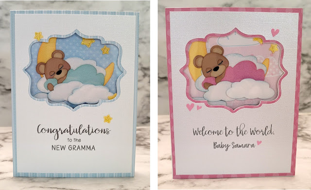
 I was in need of two baby cards. One for a dear friend who had just become a new gramma, and  another for a nephew who welcomed a new baby girl. It was nice to be able to make the same card twice, but in different colors and with different sentiments.

I started by using a fancy label cut file which I had created a while back together with the print and cut function to add the sentiment and cut a layered window on the front of my cards. Next, I adhered a piece of clear acetate in between the white and pink/blue layers.


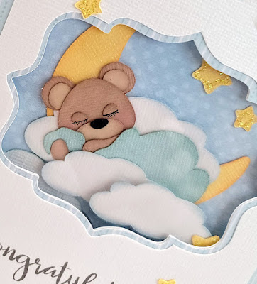
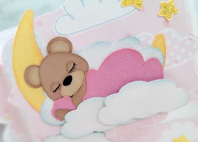
Sleeping baby bears you see through the window were paper pieced using the "Baby Boy Bear" cut file from Cuddly Cute Designs. Completed bears were then glued onto the negative piece of printed cardstock that I got from cutting the windows.


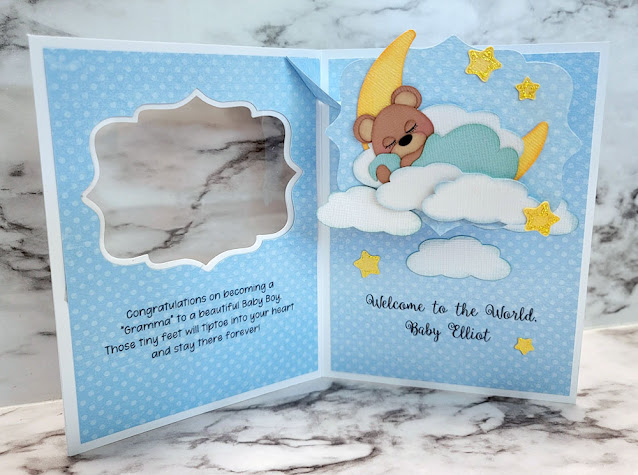
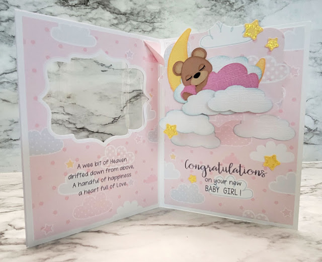
Inside, I used Karen Burniston's Katherine Label Pop Up Die.  As the cards are opened, baby bears asleep on a bed of clouds and the moon pop forward and "float" up to the top of the card.

I like using this pop up mechanism whenever I'm trying to get an image to appear to float or fly up into the sky. I've also seen this Katherine Label Pop Up mechanism used in a top fold card, and slimline cards that have two mechanisms in them... still so much to explore and experiment with this die!

Sunday, July 24, 2022

Graduation Gift Card Holder

I reluctantly purchased a ready made graduation card from Hallmark when we were surprised by a relative's graduation announcement in the mail earlier this summer. I would have preferred to send a handmade one but didn't think I could make one to send in time.  So instead, I told myself I would just make a simple personalized gift card holder in the graduate's high school colors to include with the card I had bought.

I went online to check the high school's colors and at the same time found out the school mascot was a fox. Suddenly, I felt an irresistible urge to add an image of a cute fox to the gift card holder! Crazy, huh.
I found my cute fox svg in Cuddly Cute Design's "Cutie-kins Foxes" file and resized an old (retired) graduation cap svg from Designs on Cloud Nine to fit the fox. The base svg template for the gift card holder is from My Scrap Chick.

Admittedly it took a while longer than the simple gift card holder I originally planned on making, but in the end, I did have lots more fun making it this way.


Sunday, July 17, 2022

Teddy Bears and Ice Cream

This card I made for my sister in law's birthday has two of my favorite things on it... teddy bears and ice cream! I decided I would try my take on the single window version of Sam Calcott's Fabulous Flip card again for this card.
 
Teddy bear and ice cream paper piecings for this card come from Cuddly Cute Designs' "Ice Cream Cuties" and "Ice Cream Bears" as well as Marjorie Ann Designs' "Patches the Bear Birthday" svg cut files. I used an old Cuttlebug embossing folder called "Juli's Garden" to add texture to the oval panel behind the teddy; and Lawn Fawn's "Happy Birthday Border" die for the die cut sentiment.


Pulling the frame on the front of the card to the left opens the card by allowing the panel inside the frame to flip open.

Sam Calcott's tutorial on creating this style of card using dies can be seen here. Instead of using dies, I created a template for a slightly larger version of her single window Fabulous Flip Card in Make the Cut Design Studio for my card. Sentiments were computer generated using Paper Flowers and Miss Elizabeth fonts and cut using the print and cut function and my Silhouette Cameo.

I really enjoyed making this card, and especially paper piecing all the yummy ice cream images!   As much as I love ice cream, I can't have it as often as I'd like anymore but luckily, making paper pieced versions of the cool treats seems to keep me happy!


Sunday, July 10, 2022

Flip Flap Grad Card

I recently tried another type of shutter card, which crafty You Tubers are calling a "Flip Flap Shutter Card". The interactive mechanism is very similar to the "Fabulous Flip" style cards I've been making except that the multiple shutters in this card are contained in a single frame. My first attempt at this "Flip Flap Shutter Card" was for a graduation card for a cousin's son.

Since there are three shutters on this card instead of two as in the Fabulous Flip cards, the shutters are narrower so any embellishments or decorations needed to be smaller. Most of the samples I saw on You Tube and Pinterest had their shutters decorated with scenic or decorative patterned papers with minimal embellishments. I kept my front shutters simple too, with  just the words "Class of 2022" cut in gold foil board and backed a shadow. Cut file for this was created in Make the Cut Design Program using Amazone font. The name of the high school on the bottom was added using the print and cut function.

 Instead of a pull tab, I glued a loop of gold lame ribbon between the layers of the frame for the pull. As the frame is pulled to the left, the  three shutters flip open...

...to reveal a photo of the happy graduate and family taken on graduation night!
The photo was one my cousin had sent via text message which I imported into my desktop, edited, and sent to Walgreens to be printed on glossy photo paper.  The print was then cut into thirds to fit onto the the three shutters.

I added strips of gold glitter cardstock as borders to the frame. Graduation cap and diploma on the corners were die cut using a very old Quickutz die, and "Congratulations" on the inside of the card was cut from gold glitter cardstock using an Elizabeth Crafts word die.

I added our note to the graduate on the backside. This "Flip Flap Shutter Card" was fun to put together. I think it works great for cards with flat stamped images or photos and am looking forward to giving  this card style another try real soon.


Monday, July 4, 2022

Like Coffee and Donuts...

A few months ago I had the chance to get together with two very special crafty friends to share make and take crafty projects. I put together kits to make this coffee themed card as one of my projects to share.
 

Marjorie Ann Designs cutting files "Morning Coffee" and "We Go Together Like Coffee and Donuts" were used to create all the paper pieced images for this card.
For this card project, I wanted to try a different version of the Fabulous Flip Card style. In her video tutorial for the Fabulous Flip Cards, Sam Calcott of Mixed Up Crafts explains how the two panel die cut card can be trimmed in half to create a smaller single panel one. 

I wanted to give the single panel version a try, but decided to enlarge my svg template for a larger, 4.25 x 5.5" sized card instead. Similar to the double panel Fabulous Flip card, pulling the frame to the left flips the front panel to open the card.


Although this version  of the Fabulous Flip card may not be as "fabulous" as the original double panel version, I thought it still turned out pretty neat.

The best part is that with one less panel to decorate and embellish, this card does come together a lot quicker. There is also a 4 panel/window version for a 6 x 6" square card that seems to work well with smaller images and photographs. Thinking I may have to give that one a try one day too!