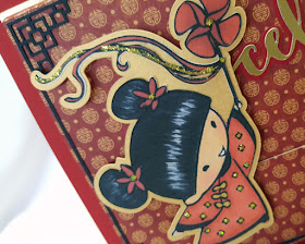
Still lovin' my stamps from Sister Stamps! I chose to use Mei Lin with her pinwheel on the front of this card, colored with Copics and added a few glittery Stickles accents.
Make the Cut design program was used to create the gold shadow for Mei Lin, as well as the Asian corners and "celebrate" sentiment. Corners were made by welding square shapes together, and I used Ballerina font to make the cutting file for "celebrate".
I'm sure most of you are familiar with the double slider type card. Pull the ribbon on one side of the card and...surprise!... another panel slides out from the the other side. But this card is just a little bit different. Did you notice that little Mei Lin slid to the right side of the card at the same time too? Neat, huh! This "Triple Slider Card" style was designed by the super talented and creative Anita Chang who teaches classes at Island's Creative Escape in Los Gatos, CA. You can see more of Anita's amazing interactive card creations on her Instagram account here.
I added our sentiment to the right sliding element,
and a little red envelope with our gift to the left sliding element.
One thing I noticed is that many people (myself included) will tend to grasp a card like this with their fingers, pinching the bottom of the card while trying to pull on the ribbon. Unfortunately this immobilizes the sliding mechanism inside, making it nearly impossible for the slider to work. Double and triple slider cards like this one should be held in the palm of one's hand with fingers gently grasping the top of the card while pulling on the ribbon. But of course I'm usually not around to tell people that when they get their cards!
To remedy the problem, I changed the outer sleeve of my card to an open ended "box-like" sleeve, and adhered it to a slightly larger (about 1/4" all around) back panel. This way, even if the card recipient grasps the bottom of the card, their fingers tend to sit on the edge of the box, allowing the mechanism inside to still slide freely. Tested this on hubby (like I do all my interactive cards) and it really works!


Brilliant card design Eunice! I have yet to try one of these. You have inspired me! I need to break out my Sister Stamps....I think I may have the skills to color them up now after all my practice! Thanks for sharing, hugs, Tina
ReplyDeleteWow Eunice! Thanks for crediting me for the “triple slider”. You did a fantastic job! Loved the raised “box” idea. We should collaborate!
ReplyDelete