Monday, November 16, 2015

Life With You Is Still SO Sweet!

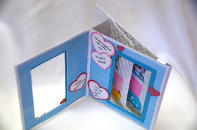
Hubby and I celebrated our 35th wedding anniversary last month and this is the card I put together for him.There's an ongoing joke around our home that he's the "Smoothie King" because he blends together the absolutely yummiest smoothies for us every weekend... acai, strawberries, bananas, pineapple, yogurt and kale...mmmm...YUM! He jokingly calls me the "Smoothie Monster" because I can slurp up those delicious smoothies he makes in no time flat. Even before he has a chance to sit down to enjoy his own drink, I'm already half way done with mine and begging for more!

So naturally, when I spied this adorable "Sweet Smoothie" cutting file over at Marjorie Ann Designs, I knew it would be perfect! All the paper piecings were cut on my Silhouette from white cardstock and colored using Copic pens. I used the Cuttlebug "Wicker Weave" embossing folder for the background on my blender mouse.

I decided to try another slider style card; this one is called a "Peek A Boo Slider". Found a very detailed and easy to follow photo tutorial for this shared by Norma on her blog, From My Craftroom. If you do a search on her blog, you'll find many of the beautiful Peek A Boo style cards Norma has created...so inspiring! In addition you can find her video tutorial for this card over at Splitcoast Stampers

As this card is opened, a panel with a new image slides over the first image seen in the window to replace it...neat!

And here's the card fully open with the new image... mousies slurping up their smoothie!

Just love these cute mousies from Marjorie Ann Designs! See the mousie on the bottom with the pinked cheeks and eyelashes? That's me!

A word about the mechanics about this card...as with most slider type cards, this Peek A Boo Slider card works best using flat images that are printed or stamped onto the sliding panels. Layered paper pieced images like the ones I've used here tend to get caught onto the sliding mechanisms making it difficult for the card to open and close smoothly. For this card I did a fix by first, adding 2 layers of adhesive foam on the top and bottom edges behind the inside panel. This prevents the paper pieced images from getting snagged onto the edges of the window by allowing the panel to slide about 1/8th inch away. Next, I added a 1/4th inch spine to the slider piece and the back panel (indicated by the red arrows) to accommodate the extra thickness from adding the foam. And lastly, I added a tab (blue arrow) to hold the inside and back panels together to keep the sliding mechanism in place. Took a bit of extra work, but this made a huge difference on how well this card opened and closed. Now that I've finally figured out a solution, I think I may be doing more of these fun slider cards again!

Saturday, November 7, 2015

Star Wars Mania Awakens

I think I've mentioned before how I go a little crazy every October with so much stuff going on...hubby. my daughter, and my son in law's birthdays, as well as our wedding anniversary. This year I decided to cheat a little. Since hubby and my son in law's birthdays are only a few days apart... and since thinking up new guy cards makes me stress... and since they're both Star Wars geeks... and since I figured they wouldn't really mind... they both got cards that looked the same on the front.
With all the anticipation and excitement of the new movie being released in December, I thought it would be fun to do a Star Wars themed card.

For the front of the card, I knew I wanted to try to and recreate something similar to the signature scrolling text effect seen at the opening of all Star Wars films. Seemed like it would be a simple enough thing to do, but I soon learned otherwise. The few tutorials I found on the web explaining how to achieve this effect on paper were way too technical for my pea brain (angling each line of text by x degrees and sizing by x points...). In the end, I decided to just place my text into a trapezoid shape, sizing and angling each line to my own liking. Spent way too much time doing this. Not perfect, but good enough for me.
I then used MTC to make a cutfile of this, had my Silhouette cut a stencil onto black cardstock and backed it with some shimmery white cardstock. Found images of the TIE fighter and AT-AT robot online and created cutfiles for those as well.


Now for the FUN part! Inspired by a  wonderful Halloween card created by my dear friend Kris (which I promise to share in a later post), I decided to do a version of Jan Tinklenberg's "Marvelous Magical Marquee Card" on the inside. Unfortunately, still photos can't capture the full very cool sliding effect of this card as it's opened. If you haven't seen this card in action, you definitely should stop in over at Jan's blog, Stamps Paper Scissors to see how this card slides as well as a video tutorial for it.

As this card for my son in law is opened, the "iris" covering the round window slides open to reveal everyone's favorite villain, Darth Vader..."MUAH HA HA HA!"

"30 YEARS OF AGE YOU ARE. WELCOME TO THE DARK SIDE..."
Found the link to this very cool free svg for Darth on Pinterest here.

Interactive sliding cards are always fun to make, but most of the time they are designed to work best with flat stamped images, and not so much with layered paper pieced images. Often I find the sliding mechanisms tend to get snagged or caught onto paper piecings, hindering the slider from working smoothly. For this particular card, I remedied the problem by adding two layers of foam tape onto the background around the image. This kept the slider about 1/8" above the image and the waxy backing layer of the foam tape provided a smooth surface for it to slide open and closed without getting caught.

And here's the inside to hubby's card...

As the card is opened, the iris lens parts to reveal little Yoda...

Got the cutting file for Yoda from the "Galaxy Friends" set over at Cuddly Cute Designs.

Pretty much happy about how these birthday cards for the guys turned out. Even happier still that I saved myself a whole lot of stress by making two cards that were similar, but still different enough for my two favorite guys!